What If You Represented as an Obsidian Graph?
An experiment in scraping 43,000 articles and visualizing them as an Obsidian knowledge graph, revealing interesting patterns about authors, difficulty tags, and content clustering.
At night (well, technically already morning), I couldn't fall asleep because of an obsessive thought in my head: "What if you represented as an Obsidian graph — would it look like a beautiful knowledge base?"
I decided to find out.
Where to Get the Dataset?
First thing, I decided to find 's API to retrieve articles. As I understood it, the APIs are closed. So I had to take a different approach.
I had an old scraper written in BeautifulSoup4 and Requests that I'd built a long time ago. I decided to revive it and adapt it for this task.
I initially tried to rewrite the scraper using asynchronous aiohttp for speed. However, 's anti-DDoS protection started blocking my requests, returning 503 status codes and blocking my IP. So I had to go back to sequential parsing at roughly 0.5 seconds per page.
While analyzing the logs, I made a curious discovery: articles with odd-numbered IDs always returned a 404 status code. It turns out that on , there are no articles with odd IDs! This observation effectively doubled my collection speed, since I could skip all odd-numbered IDs entirely.
My final dataset contained 43,000 articles. I had to limit it to that number because Obsidian takes a very long time to load larger graphs — we're talking 30-minute load times.
Building the Graph: Connections
To create a meaningful graph, I needed to define what constitutes a "connection" between nodes. I used the following types of connections:
- Complexity tags — each article's difficulty level, used for color-coding nodes in the graph
- Author information — linking articles to their respective authors
- User mentions — references to other users found within the article text
- Cross-article links — links to other articles embedded in the content
I also extracted metadata like view counts, reading time, and publication dates, but these were stored separately and not included in the graph visualization itself.
I converted the HTML formatting to Markdown compatible with Obsidian, preserving all internal links and references that authors had embedded in their articles.
Results
The resulting graph turned out to be quite interesting to explore.
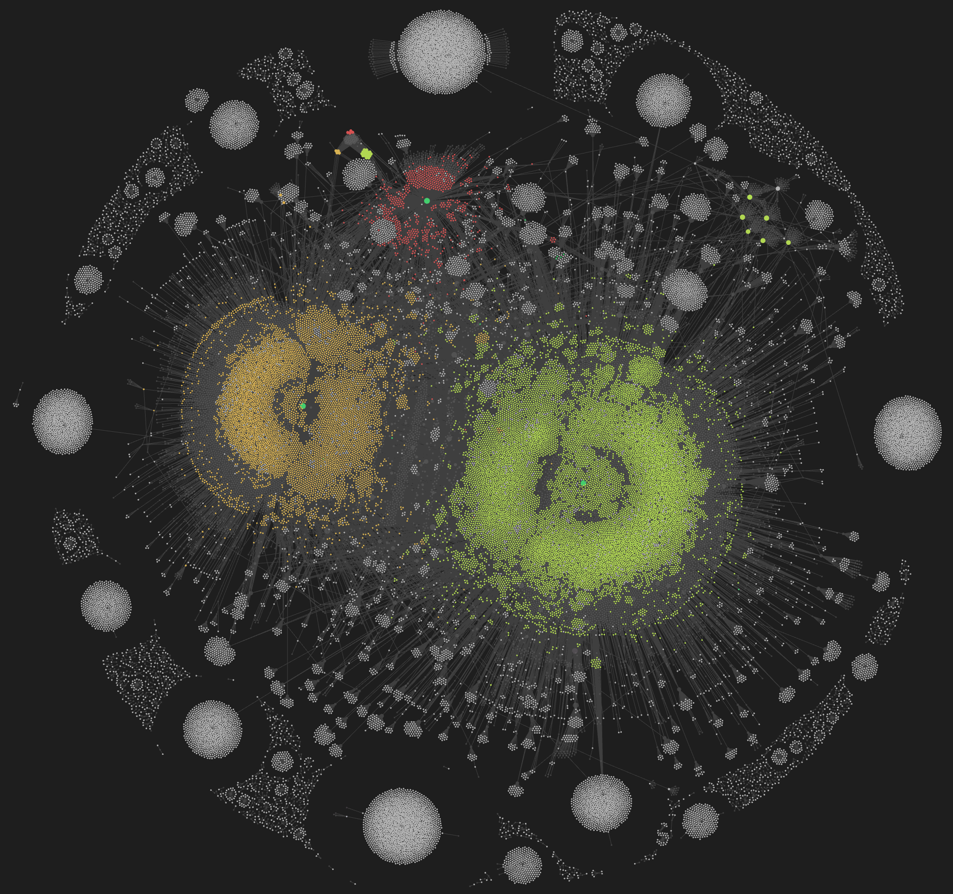
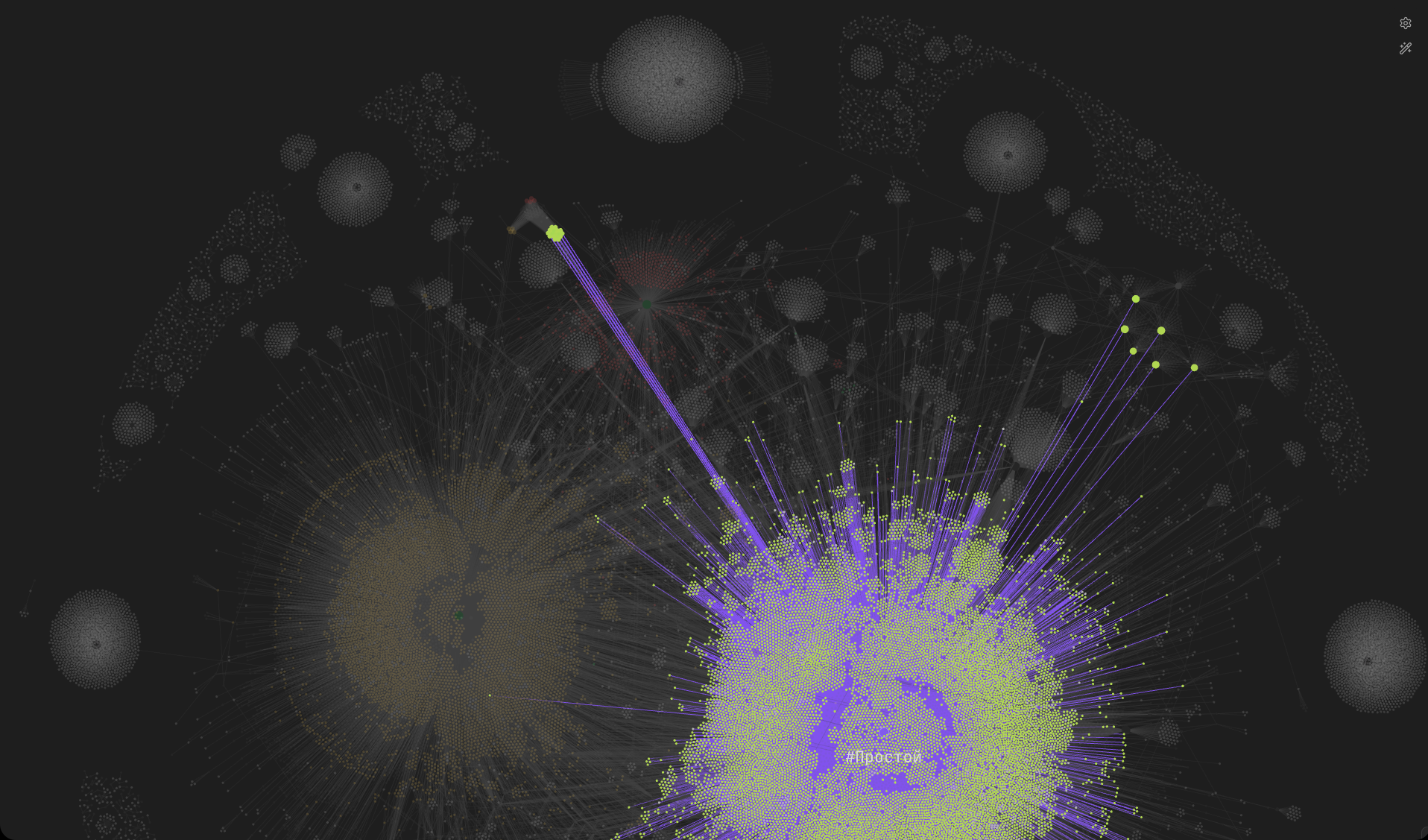
Each article appears as a point in the graph, color-coded by complexity level. You can immediately see clusters forming around prolific authors.
When you hover over any element — whether it's an article, a tag, or an author — the graph highlights all related connections, making it easy to trace relationships.
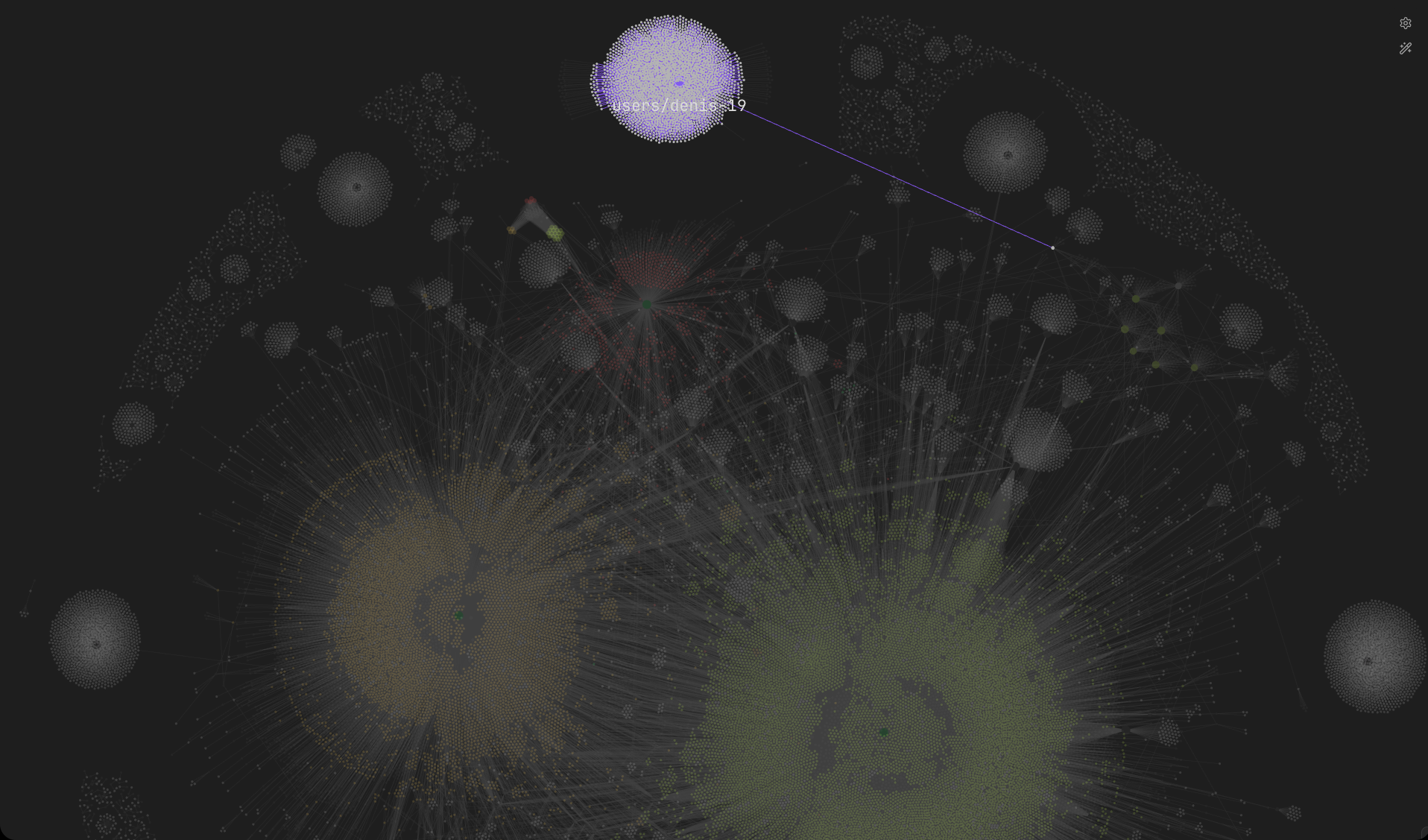
Prolific authors like @denis-19 appear as dense clusters with dozens of connections radiating outward. It's fascinating to see how some authors create tightly interconnected content while others write more standalone pieces.
The interactive nature of Obsidian's graph view makes this a genuinely useful tool for exploring relationships between articles and discovering content you might have missed.
Source Code
The complete source code for this project is available as a GitHub Gist.
FAQ
What is this article about in one sentence?
This article explains the core idea in practical terms and focuses on what you can apply in real work.
Who is this article for?
It is written for engineers, technical leaders, and curious readers who want a clear, implementation-focused explanation.
What should I read next?
Use the related articles below to continue with closely connected topics and concrete examples.