A Memo for Web Designers
A comprehensive guide for web designers covering essential principles from sketching and modular grids to scalability, typography schemes, user interaction states, and content formatting — everything a designer must consider before and during website creation.
Second version of the article, expanded and updated.
Most of this material was prepared for my talk at "RIT: Client-Side Technologies," which I unfortunately didn't make it to.
Unfortunately, a huge army of even experienced, "trendy," and impressive designers forget that the result of their work should be a website, and not just a "super screenshot" only good for a portfolio.
Originally, this memo was written for internal use, but as it grew with new material, it turned into a standalone article. I didn't discover America here — I simply gathered and formulated a set of requirements that a designer should consider during the process of designing and styling a website.
Think First, Then Do
This is a very simple and frequently violated rule. Especially by young designers.
I strongly recommend to everyone: grab a pencil and paper. Think about the goals and concept of the site. Make quick rough sketches, find the composition, approximate grid, placement of blocks and elements, quick doodles of required illustrations. And only after that sit down at the computer.
This simple approach is many times more productive, saves a ton of time, and helps find more interesting solutions.

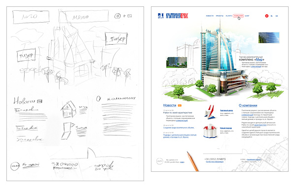
Example of a quick sketch and the resulting design
From Bigger to Smaller, From General to Specific
This is the second simple rule. And it is also frequently violated.
Classical teaching of drawing and painting says: "Move from bigger to smaller, from general to specific. First work out the overall composition, the largest masses and volumes, the biggest spots, and then refine, clarify, and saturate with details."
This rule is entirely applicable to all aspects and genres of design.
Think through your project, find the idea and composition, draw a series of sketches. And then, methodically, bring those sketches to life, starting with the grid, layout of blocks and elements, large color spots. And progressively fill them with details.
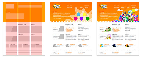
Example of step-by-step refinement and elaboration of a mockup from general to specific.
I must admit that I've often seen self-taught artists start painting a portrait from an eye, or from the pinky toe. And more than once I've seen designers start creating a website from some single specific icon. And in both cases, to my surprise, the result was interesting.
But this is a long path, often requiring major corrections and rework during the design process. Perhaps it works for art, but in design as a profession, when you need to achieve a good result within a certain deadline, I believe such an approach is unacceptable. You need guaranteed process technologies to get guaranteed results within clear deadlines. Not just "maybe it'll work, maybe it won't."
So, to summarize: "From bigger to smaller, from general to specific."
Modular Grid
One of the first decisions in the design creation process is the modular grid. A unified framework and layout scheme for all major blocks and elements that runs through every page of the website.
Grids can be simple or complex, flexible in use or not so much. That's not so important. What matters is that if you've established a specific modular grid during design — please follow it. From the first to the last page of your project. And if during the elaboration of inner pages you encounter elements that don't fit the accepted grid — it means you didn't spend enough time designing it.
Following a unified modular grid within a project will not only increase the integrity and logical perception of the site, but will also greatly simplify the developers' work.
Example of modular grid usage
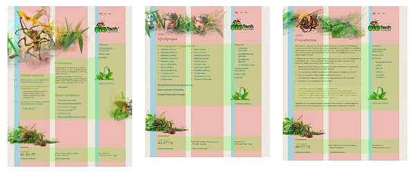
Example of modular grid usage
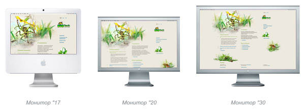
Scalability
Nowadays, when all users have vastly different monitors, it makes sense to predominantly create "fluid" websites. That is, websites that scale to match the user's monitor resolution.
Display of an elastic site on various monitors
So, when creating a "fluid" design, don't forget that:
- The overall composition should not be disrupted at any user monitor resolution.
- All elements scale depending on the user's screen size and font size.
- The entire modular grid, blocks, and other horizontal measurements scale in percentages.
- All fonts, indents, and nearly all vertical measurements scale in em. In many cases, this even applies to borders.
- Exceptions may only be images. And even then, a fixed size in px for many images is limited only to the vertical dimension.
"Compression-Expansion"
The optimal approach is the so-called "semi-fluid" layout, where the site stretches and compresses to a certain limit.
min
The first thing to start with is finding the minimum compression of the site.
The minimum width of a site is, of course, determined by the site's goals and its target audience. Currently, there are really only two minimum parameters: 760 px and 990 px. The first is optimal for corporate websites or resources targeting the broadest and most diverse audience (for example, mass services: email, search, news, etc.). The second is suitable for image-oriented and promotional websites.
We check, and if necessary adjust, every element of the modular grid to ensure there are no overlaps of elements at the minimum site compression.
max
The maximum width of a site can vary, but as a rule, it's recommended that the stretching range be no more than one and a half to two times the minimum compression size. This is because when stretching the site more than one and a half times, the composition usually falls apart.
You need to determine what will happen to the entire site when the user's monitor exceeds the maximum width. Decide how it will align. Right? Left? Centered?
Achieve a finished look for the site and its natural transition into the surrounding area at resolutions above the maximum. It is unacceptable for the site to look "cut off" on a large monitor.
Draw all illustrations and non-repeating backgrounds based on the principle "the bigger your monitor, the more you see." Typically, the width of illustrations is determined by the width of the blocks allocated to them in the modular grid at the max state.
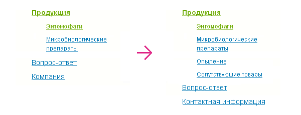
Room for Site Growth
In most tasks, unless we're talking about a business card site or a promotional site, you need to account for the fact that the number of pages and sections of the site may grow and change.
Therefore:
Navigation should be built so that adding new menu items, and especially changing the names of items, happens painlessly. It is unacceptable for adding a new section to require a complete rethinking of the navigation.
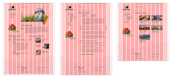
Example of "painless" modification/addition of first and second level tree navigation
In some cases, you need to provide for the painless addition/removal of information/functional blocks on the site.
Example of "painless" relocation, modification/removal of site blocks
Considering screen scalability, as well as the addition of new materials to the site, it is recommended to prefer text-based headings and navigation.
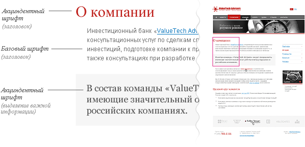
Typography Scheme
Most websites look cohesive and complete when the design is built on one to three fonts.
Base font — the main font for site content.
Display font — the font for headings.
In some cases, additional fonts are introduced for:
- menus and navigation;
- highlight blocks (important information, quotes, callouts);
- small text, to improve readability.
The designer must plan a unified overall scheme of sizes and spacing for all elements on the site, a hierarchy of headings and navigation elements (for example, for a tree menu or tag cloud). It should be consistent and used on all pages of the site.
All subsequent formatting of information on the site should be built on this overall scheme.
Typography scheme of a simple corporate website
User Interaction Feedback
The designer must plan what will happen to elements that respond to user actions.
Let's consider typical elements.
Navigation
Fragment of a site mockup showing three navigation states: normal menu appearance, menu item on hover, and current section highlighting.
Depending on the type and scale of the website, you need to show a number of navigation item states.
Typical set:
- Normal appearance.
- Cursor hovering.
- We are in this section.
- We are in this section but have navigated deeper.
- Cursor hovering over a parent section item.
The minimum set for all navigation elements, including toggles and controls, is the normal and active state. That is, the minimum for all control and navigation elements is "on/off."
Various states of a navigation element
Links
Links placed within text are always underlined and should differ in color from the main text.
It is desirable, and for navigation it is mandatory, to provide a link's appearance on cursor hover.
In large volumes of text and when displaying heterogeneous information (for example, article tables of contents, site maps, etc.), it is essential to provide a visual style for visited links. And they also require their own appearance on cursor hover.
Links with Additional Properties
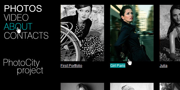
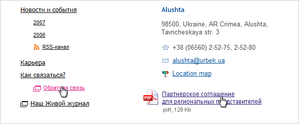
For links that include additional capabilities, especially when used within text, it is recommended to provide a small icon that hints to the user about the link's additional properties.
Such icons are needed for links that:
- provide alternative data access (RSS, PDA, print version)
- download files stored on the server
- link to popular services (Google, Flickr, LiveJournal, mapping services, Wikipedia, etc.)
- contain email addresses
- open forms
- open the link in a new window

Examples of additional icons used "in the wild."
Pseudo-links
Pseudo-links, i.e. links that don't navigate to another page but show/hide information on the current one without reloading, are marked with a dashed underline. In all other respects, everything stated for regular links applies to them.
One example of pseudo-link usage.
Tabs
Tabs are a mix of a navigation element and a control element.
For them, we account for the following states:
- tab inactive
- cursor hover (opt)
- content loader (opt)
- tab active
Fragment of a site showing three tab states at once: active tab, cursor hover, and normal inactive state.
Cursor
Provide cursor feedback on hover. Especially for non-standard controls such as navigation, pseudo-links, and tabs (hand), tooltips (help), element resizing, and drag-and-drop.
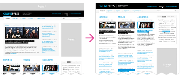
Content Formatting
On the internet, information rules. A website is merely a delivery method. The site's visual design is just a frame that sets the emotional tone and reinforces the brand.
It is while consuming information that the user spends the largest part of their time on the site. And precisely for this reason, proper attention must be given to content formatting.
Every site's goals and content are different. Therefore, the formatting of that content must always be different too.

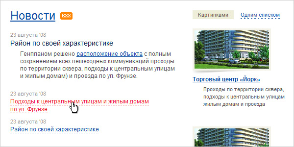
Fragment of a news site where the designer showed most of the typical content formatting elements.
Content Elements
First, it should be said that it's impossible to anticipate all possible formatting options in advance. We will consider only the typical ones.
For example, for a corporate website:
- text paragraph;
- three to four level heading hierarchy;
- links, pseudo-links;
- important information highlight element;
- blockquote;
- unordered list;
- ordered list;
- nested lists;
- full-width illustration, inline illustration;
- table or several table types;
- downloadable files;
- callouts;
- marginalia formatting, if used;
- information presented in 2–3 columns (depends on the grid);
- simple form.
Placeholder Text
Ideally, you should work with real content. If none is available, then at minimum, the placeholder text should be as typical as possible for the page being designed in both type and volume. This will help avoid gaps in the design and an embarrassing site appearance after launch.
It is completely unacceptable to use placeholder text in a different language, as text volumes and average word lengths differ. For example, the difference between English and Russian is very noticeable.
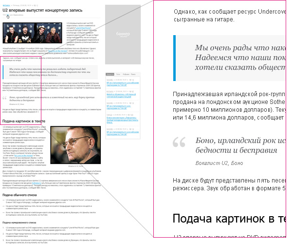
Different visual patterns of identical content blocks in different languages.
P.S.
The requirements presented here are not dogma. Any rule can sometimes be broken. You just need to do it not out of ignorance, but consciously.
About the Author
Pavel Kolodyazhny. Art director and founder of design bureau "make." Specializes in website development and interface design. Total design experience — 9 years. As author and co-author, he has been involved in the creation of over a hundred websites and about thirty interfaces. Among his works are projects for companies such as Sunbay Software, Space Adventures, Pulsar Software Systems, Canon Inc., Yandex, and Yamaha Motors. Despite past achievements, he believes the most interesting projects are still ahead.
Acknowledgments
To all my colleagues and employees, as all examples are fragments of our bureau's work. To Evgeny Cheporov, who pushed me to create this article. To Vlad Denisov, who helped me with illustrative examples.
To Yaroslav Trofimov (from Inspire) for advice and constructive criticism of the texts.
To Ira Yantseva, for proofreading, translating the English version, and for convincing me to finish the article when I wanted to give up.
To all LiveJournal and users, for comments, feedback, and questions that helped me refine and expand this material.
FAQ
What is this article about in one sentence?
This article explains the core idea in practical terms and focuses on what you can apply in real work.
Who is this article for?
It is written for engineers, technical leaders, and curious readers who want a clear, implementation-focused explanation.
What should I read next?
Use the related articles below to continue with closely connected topics and concrete examples.