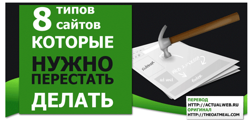
8 Types of Websites You Need to Stop Building
A Russian translation of Matthew Inman's (The Oatmeal) iconic comic satirizing the most annoying web design patterns that plagued the internet in the early 2010s.
This is a translation of a comic by Matthew Inman from the project The Oatmeal.
Previously: How Web Design Goes Straight to Hell.
The author identifies 8 types of websites that the internet would be better off without. Each category is illustrated with biting humor and painful accuracy.
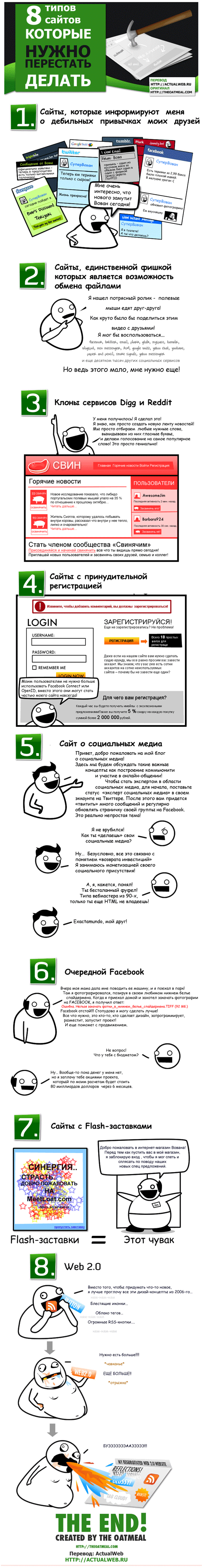
1. The Restaurant Website
You just want to find the menu, hours, and address. Instead, you get a Flash intro, background music, a 45-second loading animation, and a PDF menu that requires a separate download. The phone number is hidden somewhere in a "Contact" page nested three levels deep.
2. The Band/Musician Website
Auto-playing music blasts from your speakers the moment you open the page. There's no visible pause button. The navigation is some kind of artistic concept that makes no sense. You came to find tour dates, but instead you're trapped in an interactive "experience" that crashes your browser.
3. The "Web 2.0" Startup
A giant banner with meaningless buzzwords: "Synergize your paradigm!" "Cloud-based solutions for the social enterprise!" Somewhere, lost in the marketing fluff, is supposedly a product, but after reading the entire homepage you still have no idea what the company actually does. There are stock photos of smiling people in suits pointing at nothing.
4. The Church/Religious Organization Website
Designed in 1998 and never updated since. Comic Sans everywhere. Animated GIFs of angels and doves. A MIDI file plays automatically. The event calendar shows dates from three years ago. Built using Microsoft FrontPage.
5. The Online Store That Looks Like Spam
Flashing banners screaming "SALE!!!" in 14 different colors. Every product has a "regular price" crossed out with a "special price" next to it. Pop-ups on top of pop-ups. Fake countdown timers. Testimonials that are clearly written by the same person. The layout looks like someone vomited a flea market onto a screen.
6. The News Website
You want to read a 300-word article. First, close the newsletter popup. Then the cookie banner. Then the "subscribe to push notifications" prompt. Then the chatbot. The article itself is split across 15 pages for maximum ad impressions. Ads cover 80% of the visible screen. An auto-playing video follows you as you scroll.
7. The Portfolio Website of a "Creative" Designer
Everything is experimental. The cursor changes to something weird. Scrolling works sideways. Text is in 8pt light gray on white background because "minimalism." The portfolio pieces are beautiful but the website itself is completely unusable. It takes 30 seconds to figure out how the navigation works, and even then it's wrong.
8. The Government / Official Organization Website
Looks like it was designed by a committee of 47 people who all hate each other. Every department insisted on having their logo on the homepage. The search function returns everything except what you're looking for. Forms require Internet Explorer 6. Important documents are in .docx format. The accessibility is ironically the worst of any website category.
Click on the image to enlarge:
Original: The Oatmeal — 8 Websites You Need to Stop Building
Translator: Armen Khanoiants